I personally feel that the blog with the best understanding and contribution is the blog done by Johann Yamin, weblink: http://mutualdisguise.tumblr.com
I think that this blogpost is really interesting as it make use of examples and beautiful art pieces to critique and relate to the theories taught in the module. In addition, I feel that the art pieces that is being created provides a feeling of novelty and abstraction. Making use of techniques taught in the modules, such as negative and positive spaces and line as displayed in his advert sequence. The outcome of the art work has definitely come out with a abstract piece of artwork that viewers are able to interpret and analyse as there are many perspective to such a picture itself and based on different people's experience, people might interpret it differently. This art pieces enable users to do exploratory interpretations.
The advert sequences also did not forgo the idea that the brand actually reiterate initially. I feel that the blog does a good job to justify his processes and why and how a certain technique/picture is applied or used in the artwork.
The weekly reflection on lectures are also explained very well with real life examples and artwork, which is then applied to the concept discussed in the lectures.
Thursday, November 10, 2016
Wednesday, November 9, 2016
week 12- 13 - Final project
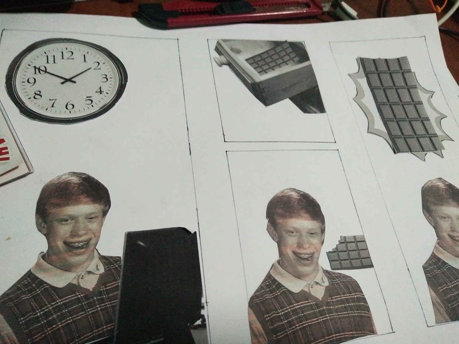
The comic strip is inspired by the meme, Unlucky brian.

In this case the comic strip is titled, " Problems in life with unlucky brian".
Response
The comics aims to depict really common problems that many people face in life such as headache, having a fire at home, lack of sleep to work, being hungry and many more that would be depicted in the comic. And also the solution to these issues.
Description
For the first six piece of comic strip, I created the comic strip digitally using photoshop, microsoft powerpoint and I wrote out all the words in the comic strips. After that, I wanted to experiment, so for the last two comic strip, I have make use of mainly collage by cutting out pictures, trying to fit into boxes that I draw out. I realised that collage might not be efficient as size and handicraft quality is an issue in piecing the parts into the comic strip.
Photoshop:

Collage processes:


Analysis and Interpretation
Basically the comic would try to tell the audience that there is no problem in life that is without solution. Even unlucky brian, who have unluckily face a myriad of problems in his life, he is not giving up and is always seeking for a solution to remedy his problem.
Evaluation and Judgment
Some people might feel that the comic might not be relatable to them while some other people might think that the individual in the comic is just unlucky and he/she would not be faced with such an issue in life.
Below are some pictures of each comic strip that would be made into a booklet.


Friday, November 4, 2016


Sunday, October 30, 2016
Week 11 - Gestalt Principles
Unity is important in visual communication. It gives a picture in a whole rather than having bits and pieces of information everywhere which might be confusing. Gestalt principles bring about some means where visual communication design could incorporate into to get more unity in the design itself. One example of using the gestalt principle is as follows:

The picture makes use of similarity of shapes and proximity of the shape to form the shape of a deer and raindrops. The unity and the use of gestalt in the poster is definitely successful as people can tell what the poster actually represents and look like, in this case, the form of a deer and raindrops from the clouds representing a storm or shower.

The picture makes use of similarity of shapes and proximity of the shape to form the shape of a deer and raindrops. The unity and the use of gestalt in the poster is definitely successful as people can tell what the poster actually represents and look like, in this case, the form of a deer and raindrops from the clouds representing a storm or shower.
Wednesday, October 26, 2016
Week 11 - 1B Advert Sequence
The three advertising sequence are to be placed as posters/billboards. Each of the sequences are actually targeting at Starbucks's main target audience for its products, busy working adults. These would be placed in Central business districts that are very visible to these working adults. The main emphasis of these advertisement sequence is that it cannot be too complicated with too many elements. Hence, visual communication present in the posters should be straight forward with only limited elements to communicate that Starbucks is actually very advocated to efforts towards saving the environment.
The first Advert piece is as follows:

Response
In the first look this would look like an anchor, with the weight holding all the elements down, include the two leaves which denote Starbucks's efforts towards a greener future. This establish Starbucks's position firmly as an advocate for saving the environment.
Description
The main techniques used for this advert would be mainly reconstruction with some scaling and the use of positive and negative spaces for the "leaves". The Starbucks logo are being scaled down to fit the picture better. The leaves are derived from the shape obtained from my line experimentation,

thereafter using negative and positive space it is converted to black for the window panels, thereafter it is scaled smaller to fit the picture better.

Analysis and Interpretation
The main idea of the picture is grounding Starbucks as an advocate of a greener environment. Each element actually indicates this point. The weights on top indicate the element of "grounded".The bridge is intentionally placed before Starbucks's logo to indicate Starbucks as a possible "bridge" for the environment to save the earth, at the same time not hurting the quality of its product, making it effortless for consumers to actually also in a way be "green".
Evaluation and Judgment
Judgement by the public varies. As the target audience are mainly working adults, experiences and perspective vary from what they see in the picture from what they glance (busy and just walk past). For example, a recreational weightlifter in this case would highly recognize the top part of the advert more possibly missing out that below the weights are the bridge. Similarly, some may recognize the bottom of the advert is an urban structure. This might affect judgement and therefore varying interpretation and catching certain elements of the picture.
The second Advert piece is as follows:

Response
In the first look this would visibly look like a mug, encased with Starbucks logo, with green sprout indicating environmental conservation by going "green".
Description
The main techniques used for this advert would be mainly repetition with some scaling and the use of positive and negative spaces for the "leaves". The Starbucks logo are being scaled down small enough to form the shape of the cup. Similarly the panda was also scaled down and only the face was cut out from the body. The leaves are derived from the shape obtained from my line experimentation,
thereafter using negative and positive space it is converted to black for the window panels, thereafter it is scaled smaller to fit the picture better.


Analysis and Interpretation
The handle of the mug make use of panda faces as it is the symbol of wildlife conservation which is recognisable by many, if not by its target audience, working adults who should already have sufficient exposure in the public and know the symbol. The sprouts on top again reiterate Starbucks as a company of conservation by its "green" element.
Evaluation and Judgment
From afar, people might not really see the handle properly and do not realise it is encased with pandas and Starbucks logo which would affect the interpretation of the advert. Nevertheless, the sprout are able to catch the attention well enough as it is something that is out of the norm - sprouts coming out of a drinking mug.
The third Advert piece is as follows:

Response
Harvesting of coffee beans often hurt the habitat of primates. This picture make use of coffee beans, starbucks logo and primates to reiterate harmony and how these elements stay together. This then indicate starbucks as being "primate" friendly despite selling coffee.
Description
The main techniques used for this advert would be mainly reconstruction. The Starbucks logo are being scaled down to fit the picture better. The primates are initially together, but to fit the picture better, it is reconstructed.

Analysis and Interpretation
The main idea is primates not shunning the starbucks logo indicating how friendly it is to the habitat of primates. The primates surrounds the logo along with the coffee bean which then reinforce the message that starbucks coffee are not harvested by destroying the environment.
Evaluation and Judgment
The part of destroying primates habitat needs some knowledge for the viewer to interpret it correctly. However, the tagline serves as an assistance and hint towards how coffee beans harvesting might be detrimental to the habitat of primates.
Tuesday, October 25, 2016
week 10- Typography and layout
Typography and layout is particularly important in terms of design to communicate well with your audience.Spaces between letters, words and lines of type contribute to design, readability, texture, tone. What we pick for headings and text passages is important. For headings, it is essential to pick type that are larger, more dominant and possibly more artistic and different from other text:

For the body, Readability is paramount. Some of the guidelines used in books and newspaper are as follows:
Typesize rules of thumb for body copy:
• 10-12 pt most readable for continuous type.
• Newspapers 9 pt.
• Classifieds 6 pt.
Layout
Similarly, layout also provides an overall neatness, readability which would also have an impact on effective communication. A neat layout enables readers to find essential and important information in an article. In a poster, layout would certainly help the user focus on what is important at first sight and subsequently where to look for additional information in a poster. For example:

The word "legless" and the picture capture the attention of the viewer and subsequently, the viewer might be curious and look for additional info, such as the words under the heading "legless" and then realising that it is actually a film. Other information could also be easily found in the neatly laid out poster.
Tuesday, October 18, 2016
week 9 - brands
Branding is very important to a organization as it represents the personality and the image that is perceived by its consumers. It is what makes a organization unique and different from other companies. This is especially important when organization makes an effort to woo their target audience to their company if their brand personality is not distinct, it makes no different from who the target audience actually purchase their product from. This is especially important for more technical products such as smartphones. Majority of the people would not know very specifically what specifications they want to have in detail for their smartphones. For example, Apple. People looking for a smartphone might recognise the brand and would save time in searching for more information pertaining to smartphone and instead, knowing the quality of Apple products, they would not look into very much details about the specifications (maybe a bit) but instead just purchase the phone , trusting the brand. It serve as a short cut for individuals to make purchasing decisions.

Subscribe to:
Comments (Atom)