I personally feel that the blog with the best understanding and contribution is the blog done by Johann Yamin, weblink: http://mutualdisguise.tumblr.com
I think that this blogpost is really interesting as it make use of examples and beautiful art pieces to critique and relate to the theories taught in the module. In addition, I feel that the art pieces that is being created provides a feeling of novelty and abstraction. Making use of techniques taught in the modules, such as negative and positive spaces and line as displayed in his advert sequence. The outcome of the art work has definitely come out with a abstract piece of artwork that viewers are able to interpret and analyse as there are many perspective to such a picture itself and based on different people's experience, people might interpret it differently. This art pieces enable users to do exploratory interpretations.
The advert sequences also did not forgo the idea that the brand actually reiterate initially. I feel that the blog does a good job to justify his processes and why and how a certain technique/picture is applied or used in the artwork.
The weekly reflection on lectures are also explained very well with real life examples and artwork, which is then applied to the concept discussed in the lectures.
Thursday, November 10, 2016
Wednesday, November 9, 2016
week 12- 13 - Final project
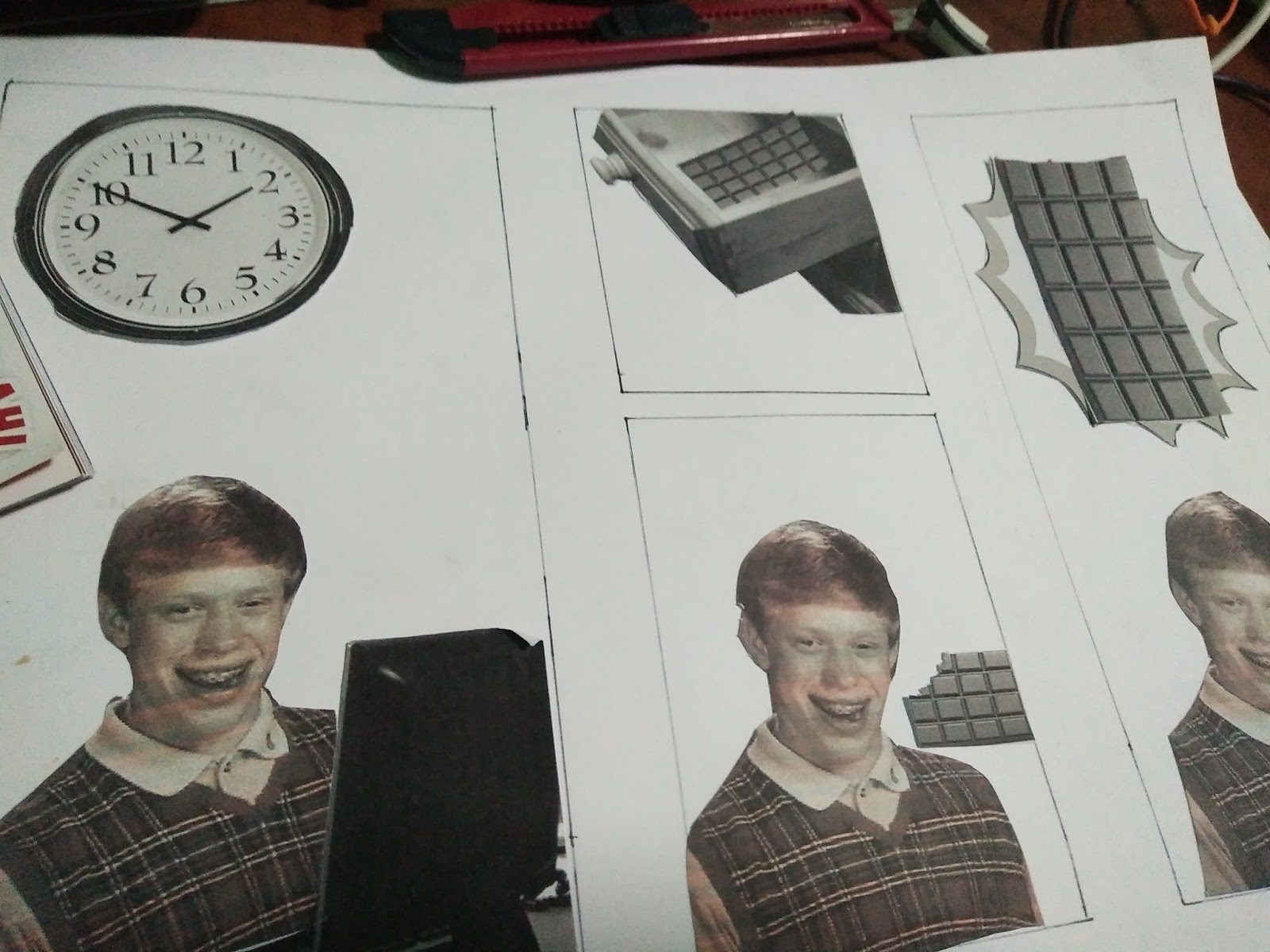
The comic strip is inspired by the meme, Unlucky brian.

In this case the comic strip is titled, " Problems in life with unlucky brian".
Response
The comics aims to depict really common problems that many people face in life such as headache, having a fire at home, lack of sleep to work, being hungry and many more that would be depicted in the comic. And also the solution to these issues.
Description
For the first six piece of comic strip, I created the comic strip digitally using photoshop, microsoft powerpoint and I wrote out all the words in the comic strips. After that, I wanted to experiment, so for the last two comic strip, I have make use of mainly collage by cutting out pictures, trying to fit into boxes that I draw out. I realised that collage might not be efficient as size and handicraft quality is an issue in piecing the parts into the comic strip.
Photoshop:

Collage processes:


Analysis and Interpretation
Basically the comic would try to tell the audience that there is no problem in life that is without solution. Even unlucky brian, who have unluckily face a myriad of problems in his life, he is not giving up and is always seeking for a solution to remedy his problem.
Evaluation and Judgment
Some people might feel that the comic might not be relatable to them while some other people might think that the individual in the comic is just unlucky and he/she would not be faced with such an issue in life.
Below are some pictures of each comic strip that would be made into a booklet.


Friday, November 4, 2016


Sunday, October 30, 2016
Week 11 - Gestalt Principles
Unity is important in visual communication. It gives a picture in a whole rather than having bits and pieces of information everywhere which might be confusing. Gestalt principles bring about some means where visual communication design could incorporate into to get more unity in the design itself. One example of using the gestalt principle is as follows:

The picture makes use of similarity of shapes and proximity of the shape to form the shape of a deer and raindrops. The unity and the use of gestalt in the poster is definitely successful as people can tell what the poster actually represents and look like, in this case, the form of a deer and raindrops from the clouds representing a storm or shower.

The picture makes use of similarity of shapes and proximity of the shape to form the shape of a deer and raindrops. The unity and the use of gestalt in the poster is definitely successful as people can tell what the poster actually represents and look like, in this case, the form of a deer and raindrops from the clouds representing a storm or shower.
Wednesday, October 26, 2016
Week 11 - 1B Advert Sequence
The three advertising sequence are to be placed as posters/billboards. Each of the sequences are actually targeting at Starbucks's main target audience for its products, busy working adults. These would be placed in Central business districts that are very visible to these working adults. The main emphasis of these advertisement sequence is that it cannot be too complicated with too many elements. Hence, visual communication present in the posters should be straight forward with only limited elements to communicate that Starbucks is actually very advocated to efforts towards saving the environment.
The first Advert piece is as follows:

Response
In the first look this would look like an anchor, with the weight holding all the elements down, include the two leaves which denote Starbucks's efforts towards a greener future. This establish Starbucks's position firmly as an advocate for saving the environment.
Description
The main techniques used for this advert would be mainly reconstruction with some scaling and the use of positive and negative spaces for the "leaves". The Starbucks logo are being scaled down to fit the picture better. The leaves are derived from the shape obtained from my line experimentation,

thereafter using negative and positive space it is converted to black for the window panels, thereafter it is scaled smaller to fit the picture better.

Analysis and Interpretation
The main idea of the picture is grounding Starbucks as an advocate of a greener environment. Each element actually indicates this point. The weights on top indicate the element of "grounded".The bridge is intentionally placed before Starbucks's logo to indicate Starbucks as a possible "bridge" for the environment to save the earth, at the same time not hurting the quality of its product, making it effortless for consumers to actually also in a way be "green".
Evaluation and Judgment
Judgement by the public varies. As the target audience are mainly working adults, experiences and perspective vary from what they see in the picture from what they glance (busy and just walk past). For example, a recreational weightlifter in this case would highly recognize the top part of the advert more possibly missing out that below the weights are the bridge. Similarly, some may recognize the bottom of the advert is an urban structure. This might affect judgement and therefore varying interpretation and catching certain elements of the picture.
The second Advert piece is as follows:

Response
In the first look this would visibly look like a mug, encased with Starbucks logo, with green sprout indicating environmental conservation by going "green".
Description
The main techniques used for this advert would be mainly repetition with some scaling and the use of positive and negative spaces for the "leaves". The Starbucks logo are being scaled down small enough to form the shape of the cup. Similarly the panda was also scaled down and only the face was cut out from the body. The leaves are derived from the shape obtained from my line experimentation,
thereafter using negative and positive space it is converted to black for the window panels, thereafter it is scaled smaller to fit the picture better.


Analysis and Interpretation
The handle of the mug make use of panda faces as it is the symbol of wildlife conservation which is recognisable by many, if not by its target audience, working adults who should already have sufficient exposure in the public and know the symbol. The sprouts on top again reiterate Starbucks as a company of conservation by its "green" element.
Evaluation and Judgment
From afar, people might not really see the handle properly and do not realise it is encased with pandas and Starbucks logo which would affect the interpretation of the advert. Nevertheless, the sprout are able to catch the attention well enough as it is something that is out of the norm - sprouts coming out of a drinking mug.
The third Advert piece is as follows:

Response
Harvesting of coffee beans often hurt the habitat of primates. This picture make use of coffee beans, starbucks logo and primates to reiterate harmony and how these elements stay together. This then indicate starbucks as being "primate" friendly despite selling coffee.
Description
The main techniques used for this advert would be mainly reconstruction. The Starbucks logo are being scaled down to fit the picture better. The primates are initially together, but to fit the picture better, it is reconstructed.

Analysis and Interpretation
The main idea is primates not shunning the starbucks logo indicating how friendly it is to the habitat of primates. The primates surrounds the logo along with the coffee bean which then reinforce the message that starbucks coffee are not harvested by destroying the environment.
Evaluation and Judgment
The part of destroying primates habitat needs some knowledge for the viewer to interpret it correctly. However, the tagline serves as an assistance and hint towards how coffee beans harvesting might be detrimental to the habitat of primates.
Tuesday, October 25, 2016
week 10- Typography and layout
Typography and layout is particularly important in terms of design to communicate well with your audience.Spaces between letters, words and lines of type contribute to design, readability, texture, tone. What we pick for headings and text passages is important. For headings, it is essential to pick type that are larger, more dominant and possibly more artistic and different from other text:

For the body, Readability is paramount. Some of the guidelines used in books and newspaper are as follows:
Typesize rules of thumb for body copy:
• 10-12 pt most readable for continuous type.
• Newspapers 9 pt.
• Classifieds 6 pt.
Layout
Similarly, layout also provides an overall neatness, readability which would also have an impact on effective communication. A neat layout enables readers to find essential and important information in an article. In a poster, layout would certainly help the user focus on what is important at first sight and subsequently where to look for additional information in a poster. For example:

The word "legless" and the picture capture the attention of the viewer and subsequently, the viewer might be curious and look for additional info, such as the words under the heading "legless" and then realising that it is actually a film. Other information could also be easily found in the neatly laid out poster.
Tuesday, October 18, 2016
week 9 - brands
Branding is very important to a organization as it represents the personality and the image that is perceived by its consumers. It is what makes a organization unique and different from other companies. This is especially important when organization makes an effort to woo their target audience to their company if their brand personality is not distinct, it makes no different from who the target audience actually purchase their product from. This is especially important for more technical products such as smartphones. Majority of the people would not know very specifically what specifications they want to have in detail for their smartphones. For example, Apple. People looking for a smartphone might recognise the brand and would save time in searching for more information pertaining to smartphone and instead, knowing the quality of Apple products, they would not look into very much details about the specifications (maybe a bit) but instead just purchase the phone , trusting the brand. It serve as a short cut for individuals to make purchasing decisions.

Friday, October 14, 2016
Additional research/brainstorm for brand and campaign
The green campaign would be targeted at working adults, majority aged 25
and beyond. The reason for picking this group is that according to a
study, they are more experienced and there's a lower chance of them
misapprehending the true message behind the advertisement . The advert
would aim to maintain the element of it being hip and contemporary as
the target audience are mainly urbanites who have a considerably high
income and yearning for social welfare which is crucial to maintain the
element of "benefits"/ possible fear in losing their social welfare in
the message itself.
Study taken from : https://www.acrwebsite.org/search/view-conference-proceedings.aspx?Id=8206
Facts on deforestation
Loss of species: Seventy percent of the world’s plants and animals live in forests and are losing their habitats to deforestation, according to National Geographic. Loss of habitat can lead to species extinction. It also has negative consequences for medicinal research and local populations who rely on the animals and plants in the forests for hunting and medicine.
Water cycle: Trees are important to the water cycle. They absorb rain fall and produce water vapor that is released into the atmosphere. Trees also lessen the pollution in water, according to the North Carolina State University, by stopping polluted runoff. In the Amazon, more than half the water in the ecosystem is held within the plants, according to the National Geographic Society.
Soil erosion: Tree roots anchor the soil. Without trees, the soil is free to wash or blow away, which can lead to vegetation growth problems. The WWF states that scientists estimate that a third of the world’s arable land has been lost to deforestation since 1960. After a clear cutting, cash crops like coffee, soy and palm oil are planted. Planting these types of trees can cause further soil erosion because their roots cannot hold onto the soil. "The situation in Haiti compared to the Dominican Republic is a great example of the important role forests play in the water cycle," Daley said. Both countries share the same island, but Haiti has much less forest cover than the Dominican Republic. As a result, Haiti has endured more extreme soil erosion, flooding and landslide issues.
Life quality: Soil erosion can also lead to silt entering the lakes, streams and other water sources.
This can decrease local water quality and contribute to poor health in populations in the area.
Taken from :http://www.livescience.com/27692-deforestation.html
accidents when driving through rural area (soil erosion - fear)
bad air quality
Study taken from : https://www.acrwebsite.org/search/view-conference-proceedings.aspx?Id=8206
Facts on deforestation
Other effects of deforestation
Forests are complex ecosystems that affect almost every species on the planet. When they are degraded, it can set off a devastating chain of events both locally and around the world.Loss of species: Seventy percent of the world’s plants and animals live in forests and are losing their habitats to deforestation, according to National Geographic. Loss of habitat can lead to species extinction. It also has negative consequences for medicinal research and local populations who rely on the animals and plants in the forests for hunting and medicine.
Water cycle: Trees are important to the water cycle. They absorb rain fall and produce water vapor that is released into the atmosphere. Trees also lessen the pollution in water, according to the North Carolina State University, by stopping polluted runoff. In the Amazon, more than half the water in the ecosystem is held within the plants, according to the National Geographic Society.
Soil erosion: Tree roots anchor the soil. Without trees, the soil is free to wash or blow away, which can lead to vegetation growth problems. The WWF states that scientists estimate that a third of the world’s arable land has been lost to deforestation since 1960. After a clear cutting, cash crops like coffee, soy and palm oil are planted. Planting these types of trees can cause further soil erosion because their roots cannot hold onto the soil. "The situation in Haiti compared to the Dominican Republic is a great example of the important role forests play in the water cycle," Daley said. Both countries share the same island, but Haiti has much less forest cover than the Dominican Republic. As a result, Haiti has endured more extreme soil erosion, flooding and landslide issues.
Life quality: Soil erosion can also lead to silt entering the lakes, streams and other water sources.
This can decrease local water quality and contribute to poor health in populations in the area.
Taken from :http://www.livescience.com/27692-deforestation.html
Possible effects on urbanite adults
Lousy view when they go on an expensive holidayaccidents when driving through rural area (soil erosion - fear)
bad air quality
Wednesday, October 12, 2016
Brand research
Chosen brand:

Logo meaning
Company profile:
The first starbucks store opened in 1971.
Back then, the company was a single store in Seattle’s historic Pike Place Market. From just a narrow storefront, Starbucks offered some of the world’s finest fresh-roasted whole bean coffees. In 1981, Howard Schultz (Starbucks chairman and chief executive officer) had first walked into a Starbucks store. From his first cup of Sumatra,
Howard was drawn into Starbucks and joined a year later.
In 1983, Howard traveled to Italy and became captivated with Italian coffee bars and the romance of the coffee experience. He had a vision to bring the Italian coffeehouse tradition back to the United States. A place for conversation and a sense of community. A third place between work and home. He left Starbucks for a short period of time to start his own Il Giornale coffeehouses and returned in August 1987 to purchase Starbucks with the help of local investors.
The mission is to inspire and nurture the human spirit – one person, one cup, and one neighborhood at a time.
Currently, Starbucks has a total of 22,519 stores (as of June 28 2015)
https://www.starbucks.com/about-us/company-information
Target audience segmentation:
Taken from : http://smallbusiness.chron.com/starbucks-target-audience-10553.html
Company ethics:
Starbucks claim:
Starbucks believes that conducting business ethically and striving to do the right thing are vital to the success of the company.
Business Ethics and Compliance is a program that supports Our Starbucks Mission and helps protect our culture and our reputation by providing resources that help partners make ethical decisions at work.
The program develops and distributes awareness materials, including the Standards of Business Conduct; facilitates legal compliance and ethics training; investigates sensitive issues such as potential conflicts of interest; and provides additional channels for partners to voice concerns. Partners are encouraged to report all types of issues or concerns to the program through their choice of the offered communication channels
External source:
The "Starbucks Business Ethics and Compliance: Standards of Business Conduct" document lays an ethical framework for the company's mission "to inspire and nurture the human spirit -- one person, one cup, and one neighborhood at a time." This document outlines Starbucks' rigorous policies regulating workplace environment and diversity, sustainable business practices, and community involvement. A commitment to environmental responsibility has been a core company value since its founding, and each individual Starbucks employee and partner is held to a specific environmental mission statement. For its dedication to corporate social and environmental responsibility, Starbucks has been ranked as one of Corporate Responsibility Magazine's "100 Best Corporate Citizens 2013" and as Ethisphere's "World's Most Ethical Companies 2013."
Taken from : https://berkleycenter.georgetown.edu/publications/starbucks-business-ethics-and-compliance-standards-of-business-conduct
Some of starbucks notable historical campaign :
Making use of "being green" to grow its brand
http://ibrandstudio.com/articles/starbucks-green-marketing-campaign
Advertising campaigns of recent:
Starbucks forgo the tradition media
Short Answer: They haven’t needed it. Word of mouth drove the business.
AND…most of the ads you’ve seen featuring Starbucks have been done by partners like Kraft and Pepsi promoting Starbucks ice cream, bottled Frappuccino, whole beans, not ads for the stores.
CEO of Starbucks Howard Schultz always said, “our stores are our billboard.”
Taken from: http://observer.com/2015/10/why-starbucks-chose-to-forego-traditional-advertising-for-so-long/
However, many people do not know about Starbucks being "green" rather people know them for their coffee. Perhaps an advert could bring about Starbucks efforts.
Study taken from : https://www.acrwebsite.org/search/view-conference-proceedings.aspx?Id=8206
Logo meaning
In
1971, Starbucks (then a mere fledging coffee shop on the Seattle
waterfront) was looking for a logo, something that would embody the
seafaring history of its home city. The three founders hired a consultant named Terry Heckler.[...]
Heckler “pored over old marine books until he came up with a logo based
on an old 16th-century Norse woodcut: a two-tailed mermaid.”
The
mermaid was exotic. She was also topless. At first, and despite some
complaints, Starbucks just rolled with it. As Schultz later explained,
“Bare breasted and Rubenesque, [the mermaid] was supposed to be as
seductive as the coffee itself.” The logo has since changed to the one above.
Taken from:http://www.adweek.com/news/advertising-branding/how-topless-mermaid-made-starbucks-cup-icon-160396
Company profile:
The first starbucks store opened in 1971.
Back then, the company was a single store in Seattle’s historic Pike Place Market. From just a narrow storefront, Starbucks offered some of the world’s finest fresh-roasted whole bean coffees. In 1981, Howard Schultz (Starbucks chairman and chief executive officer) had first walked into a Starbucks store. From his first cup of Sumatra,
Howard was drawn into Starbucks and joined a year later.
In 1983, Howard traveled to Italy and became captivated with Italian coffee bars and the romance of the coffee experience. He had a vision to bring the Italian coffeehouse tradition back to the United States. A place for conversation and a sense of community. A third place between work and home. He left Starbucks for a short period of time to start his own Il Giornale coffeehouses and returned in August 1987 to purchase Starbucks with the help of local investors.
The mission is to inspire and nurture the human spirit – one person, one cup, and one neighborhood at a time.
Currently, Starbucks has a total of 22,519 stores (as of June 28 2015)
https://www.starbucks.com/about-us/company-information
Target audience segmentation:
Adults
Starbucks’ primary target market is men and women aged 25 to 40. They account for almost half (49 percent) of its total business. Starbucks’ appeal to this consumer age group through hip, contemporary design that is consistent in its advertising and decor, and working to keep its products current as status symbols. Customers tend to be urbanites with relatively high income, professional careers and a focus on social welfare. This target audience grows at a rate of 3 percent annually.Young Adults
Young adults, aged 18 to 24, total 40 percent of Starbucks’ sales. Starbucks positions itself as a place college students can hang out, study, write term papers and meet people. Starbucks appeals to this consumer directly through introducing technology as soon as it comes available, focusing on social networking and actively cultivating a “cool” image. The young adult audience grows 4.6 percent each year.Taken from : http://smallbusiness.chron.com/starbucks-target-audience-10553.html
Company ethics:
Starbucks claim:
Starbucks believes that conducting business ethically and striving to do the right thing are vital to the success of the company.
Business Ethics and Compliance is a program that supports Our Starbucks Mission and helps protect our culture and our reputation by providing resources that help partners make ethical decisions at work.
The program develops and distributes awareness materials, including the Standards of Business Conduct; facilitates legal compliance and ethics training; investigates sensitive issues such as potential conflicts of interest; and provides additional channels for partners to voice concerns. Partners are encouraged to report all types of issues or concerns to the program through their choice of the offered communication channels
External source:
The "Starbucks Business Ethics and Compliance: Standards of Business Conduct" document lays an ethical framework for the company's mission "to inspire and nurture the human spirit -- one person, one cup, and one neighborhood at a time." This document outlines Starbucks' rigorous policies regulating workplace environment and diversity, sustainable business practices, and community involvement. A commitment to environmental responsibility has been a core company value since its founding, and each individual Starbucks employee and partner is held to a specific environmental mission statement. For its dedication to corporate social and environmental responsibility, Starbucks has been ranked as one of Corporate Responsibility Magazine's "100 Best Corporate Citizens 2013" and as Ethisphere's "World's Most Ethical Companies 2013."
2016 World’s Most Ethical Company®
For the 10th year in a row, the Ethisphere Institute has named Starbucks to the list.Taken from : https://berkleycenter.georgetown.edu/publications/starbucks-business-ethics-and-compliance-standards-of-business-conduct
Some of starbucks notable historical campaign :
At this time not a few companies that have switched to choose green marketing campaign to promote they products, but not all companies
are quite serious in the campaign, the seriousness of doing green
marketing campaign can be judged from the campaign conducted
continuously and sustainably. In this case, my value of Starbucks is
quite serious in implementing green marketing campaign, not just trying
to lure consumers alone but he really did to save the planet. Various
strategies have been carried out by Starbucks in making green marketing
campaign become interesting, that’s why I interesting to discuss
Starbucks in this article.
http://ibrandstudio.com/articles/starbucks-green-marketing-campaign
Advertising campaigns of recent:
Starbucks forgo the tradition media
Short Answer: They haven’t needed it. Word of mouth drove the business.
AND…most of the ads you’ve seen featuring Starbucks have been done by partners like Kraft and Pepsi promoting Starbucks ice cream, bottled Frappuccino, whole beans, not ads for the stores.
CEO of Starbucks Howard Schultz always said, “our stores are our billboard.”
Taken from: http://observer.com/2015/10/why-starbucks-chose-to-forego-traditional-advertising-for-so-long/
However, many people do not know about Starbucks being "green" rather people know them for their coffee. Perhaps an advert could bring about Starbucks efforts.
Study taken from : https://www.acrwebsite.org/search/view-conference-proceedings.aspx?Id=8206
Saturday, October 8, 2016
Week 8 lecture reflection - harmony, contrast, repetition, unity
Harmony is very important in design. In harmony, elements should all look like it is an entity for example in a poster, if not certain elements would look as if it is not part of the image and hence losing the element of harmony. Having one or more element that is not harmonious with the rest also would possibly make the art piece sloppy and . For example, take a look at a messy and disorganised room, everything is not consistent and different random elements actually make the room look really sloppy:

Making use of contrast bring about focal points and important elements. That is making use of contrast to ensure that an element actually look different from the rest in term of size, colour or shape. But certain attributes still retains to ensure that it is harmonious with other elements. One example would be a movie poster which make use of contrast to bring out the idea of the poster itself, the black and white increases the contrast of two different separate elements which make the two shape separate from each other at the same time, it is harmonious as two elements look closely related as one entity:

Having this two element, we can say that there is unity in the design poster as elements sort of "glue" together as one. Balance can also be seen in the poster above as there is no uneven distribution of elements (ie one side more stuff than the other) it looks really even. Another concept is repetition, giving viewers a predictable frequency or rhythm which is able to create unity in design. One example is as follows, everything is repeated and it makes the whole art piece look really "unified" as one entity.:

Week 8 tutorial - graphic illustration 1A - graphic design

Response
This picture is actually a collage of many different elements pieced out to form the shape of a peacock. A male peacock is an animal who attempt to make use of its "feathers" to show off or attract its female counterpart. In this sense, the picture consist of elements in the urban landscapes, modern sports cars, modern military forces, animals, houses, scenery and modern writing instruments. All these portray mostly the elements of attractiveness and "show off".
Description
Making use of techniques such as repetition, i created the two side's feather of t he peacock. The papercut of the car and the animals are put over a black piece of paper and photocopied. The dog's head for the positive and negative spaces are being photocopied and cut out. The traced pictures to create lines is also photocopied to form parts of the peacock feather. The other elements are being reconstructed to form the shape of the peacock.
Analysis and Interpretation
The art piece actually want to portray the element of showing off - through many means - For urban landscape, government continually beautify its cities to attract tourist, just like the peacock. Sports cars similarly is to show off, modern military for the government to show off its prowess, the rest of element portraying attractiveness. This is apt and similar to the characteristic of the peacock who also shows off its beautiful feather.
Evaluation and Judgment
However, people might not think otherwise. At first glance it might not exactly look like a peacock totally until a while, people might think of peacock as a beautiful bird but not as an animal who show off. Only people who have the knowledge that a peacock actually uses its feather to attract its female counterparts, then they would better interpret the art piece.
process pictures:


Wednesday, October 5, 2016
week 7 lecture reflection - colour
In general, studying colour is very important in visual communication. Understanding the mechanics of subtractive and addictive colour systems could actually help the visual designer actually come out with the desired effects shown ultimately to the audiences. For example, for poster design, it is important to use the right colour combination to actually ensure that important elements are standing out of the rest of the elements and not having every element to scream for attention. Another example would be interior design. Certain stores make use of certain colours depending on what they are selling or what service they are providing. For example, for a SPA, providing a relaxation service, it is crucial for the store owners to choose carefully and decide whether to make use of warm colours vs cool colours for their desired effect. Making use of warm colours bring about a more intimate and cosy feel while for cool colours, the ability to calm and soothe.
In a colour wheel, colours opposite of each other tend to compliment each other in web design.

For example, look at the opposite colour of orange and blue. NUS make use of this two colours to actually make its logo.

In a colour wheel, colours opposite of each other tend to compliment each other in web design.
For example, look at the opposite colour of orange and blue. NUS make use of this two colours to actually make its logo.
Friday, September 30, 2016
Tutorial week 7 - Stencils and paper cuts
The first image is used to create a stencil:

Response
Personally, this art piece portray how military forces have to keep hostile forces at bay day and night which is why the background is a sunset background.
Description
It is actually a photo taken on low contrast and lighting to only display the shadows instead of having prominent features.
Analysis and Interpretation
This picture convey the ideas how military forces are working 24/7 without fail to keep the country's defense force strong and going. The hardship they have to go through out in the wilderness and trainings they have to go through to maintain their combat readiness.
Evaluation and judgment
People who have not serve the military forces would not understand the hardship and would probably interpret the picture differently.
Making use of a tracing paper and hard A4 card, I created the stencil on the hard A4 card

I have to cut out the stencil in the opposite manner instead of having the outline on the piece of white paper as the figure on the right, the gap between the figure's leg cannot be bridged if it is not done this way.

The second image that is used is as follows (paper cut):

Response
Personally, this art piece portray how many primates like animals gather together to form a fan like feature
Description
It is actually a photo taken on sharp contrast and high lighting to reveal many of its features
Analysis and Interpretation
This portray how animals should not be in captive. Animals should be free and hunt for their own food whenever they are hungry instead of being fed at intervals.
Evaluation and judgment
Many people would not know the implications behind animal captivity and take things at face value, animals are being fed well.
Making it a stencil would not be effective as this has a lot of complicated elements and is hard to actually carve out details for the stencil. Hence, I used this image for a paper cut. Nevertheless it is still really complicated (especially the tail). Similarly as image one, I transferred it on a A4 white card via a tracing paper before cutting it.

This is the final papercut, to make it more apparent that it is a picture of animals gathering, I cut out their ears to make it more obvious.

Some of the problems faced with this work is that the bridging for the tail should be taken note of. I broke some of the bridging while cutting the artpiece.

The third image is used as a stencil as follows:

Response
Personally, this art piece portray how baby animals are being exploited from young.
Description
It is actually a photo taken on sharp contrast and high lighting to reveal many of its features
Analysis and Interpretation
This portray how animals should not be in captive and should be released and learning appropriate skills in the wild rather than being in captive.
Evaluation and judgment
Many people would not know the implications behind animal captivity and take things at face value, animals being cute and well groomed. But little did they know that the baby panda might lack essential skills to survive in the wild.
The stencil look as follows:

Initially, tried adding more features such as the paws into the stencil but seems like it does not help in making it obvious that it is a panda and at the same time, bridging the claws is very challenging, I tried and broke the bridge and end up cutting out the whole piece instead of including the details.
The fourth image is cut out as a papercut. The image is as follows:

Response
Personally, this art piece portray how users should be environmentally friendly minded and adopt more energy saving and hybrid cars
Description
It is actually a photo taken on sharp contrast and high lighting to reveal many of its features of the cars to let viewers know it is a hybrid car.
Analysis and Interpretation
People might not want to spend extra money on a hybrid car, which might bring inconvenience for them when they want to refuel/ charge the car. But the picture encourages users to actually adopt hybrid car as it would better save the environment.
Evaluation and judgment
It would be hard to change the mindsets of people, people who want a car either buy it for convenience or luxury, never there is a point of time it is for the earth, Making it hard to change the minds of people towards the interpretation of the image.
Tracing the little details such as the window pane and the details on the wheels is crucial in making it look like a car. Ultimately some details such as the side window pane has to be left out as the whole window is being cut out:

Omitting details on the background rather than the car, the final results is as follows:

One of the most challenging part would be the front bumper of the car, with very intricate bridging which i broke one side of it:

Spray painting the stencils of image 1 and 3:
The spray paint used is as follows:

In the future, when spray painting a test should be done as in this case the first spray tend to spray alot of paint out of the can which nearly spoil the stencil:

As seen in the image one side of the image has too much paint, fortunately, it did not do any much serious damage.
Image 1 Spray paint results:

Image 3 Spray paint results:


Response
Personally, this art piece portray how military forces have to keep hostile forces at bay day and night which is why the background is a sunset background.
Description
It is actually a photo taken on low contrast and lighting to only display the shadows instead of having prominent features.
Analysis and Interpretation
This picture convey the ideas how military forces are working 24/7 without fail to keep the country's defense force strong and going. The hardship they have to go through out in the wilderness and trainings they have to go through to maintain their combat readiness.
Evaluation and judgment
People who have not serve the military forces would not understand the hardship and would probably interpret the picture differently.
Making use of a tracing paper and hard A4 card, I created the stencil on the hard A4 card

I have to cut out the stencil in the opposite manner instead of having the outline on the piece of white paper as the figure on the right, the gap between the figure's leg cannot be bridged if it is not done this way.

The second image that is used is as follows (paper cut):

Response
Personally, this art piece portray how many primates like animals gather together to form a fan like feature
Description
It is actually a photo taken on sharp contrast and high lighting to reveal many of its features
Analysis and Interpretation
This portray how animals should not be in captive. Animals should be free and hunt for their own food whenever they are hungry instead of being fed at intervals.
Evaluation and judgment
Many people would not know the implications behind animal captivity and take things at face value, animals are being fed well.
Making it a stencil would not be effective as this has a lot of complicated elements and is hard to actually carve out details for the stencil. Hence, I used this image for a paper cut. Nevertheless it is still really complicated (especially the tail). Similarly as image one, I transferred it on a A4 white card via a tracing paper before cutting it.

This is the final papercut, to make it more apparent that it is a picture of animals gathering, I cut out their ears to make it more obvious.

Some of the problems faced with this work is that the bridging for the tail should be taken note of. I broke some of the bridging while cutting the artpiece.

The third image is used as a stencil as follows:

Response
Personally, this art piece portray how baby animals are being exploited from young.
Description
It is actually a photo taken on sharp contrast and high lighting to reveal many of its features
Analysis and Interpretation
This portray how animals should not be in captive and should be released and learning appropriate skills in the wild rather than being in captive.
Evaluation and judgment
Many people would not know the implications behind animal captivity and take things at face value, animals being cute and well groomed. But little did they know that the baby panda might lack essential skills to survive in the wild.
The stencil look as follows:

Initially, tried adding more features such as the paws into the stencil but seems like it does not help in making it obvious that it is a panda and at the same time, bridging the claws is very challenging, I tried and broke the bridge and end up cutting out the whole piece instead of including the details.
The fourth image is cut out as a papercut. The image is as follows:

Response
Personally, this art piece portray how users should be environmentally friendly minded and adopt more energy saving and hybrid cars
Description
It is actually a photo taken on sharp contrast and high lighting to reveal many of its features of the cars to let viewers know it is a hybrid car.
Analysis and Interpretation
People might not want to spend extra money on a hybrid car, which might bring inconvenience for them when they want to refuel/ charge the car. But the picture encourages users to actually adopt hybrid car as it would better save the environment.
Evaluation and judgment
It would be hard to change the mindsets of people, people who want a car either buy it for convenience or luxury, never there is a point of time it is for the earth, Making it hard to change the minds of people towards the interpretation of the image.
Tracing the little details such as the window pane and the details on the wheels is crucial in making it look like a car. Ultimately some details such as the side window pane has to be left out as the whole window is being cut out:

Omitting details on the background rather than the car, the final results is as follows:

One of the most challenging part would be the front bumper of the car, with very intricate bridging which i broke one side of it:

Spray painting the stencils of image 1 and 3:
The spray paint used is as follows:

In the future, when spray painting a test should be done as in this case the first spray tend to spray alot of paint out of the can which nearly spoil the stencil:

As seen in the image one side of the image has too much paint, fortunately, it did not do any much serious damage.
Image 1 Spray paint results:

Image 3 Spray paint results:

Subscribe to:
Comments (Atom)